Maps or I Pads?

airlines-110705

A few months ago I bought a so called smart phone just so that I could use it as a satellite navigation tool. I never wanted to do it, but now I live in a new country (again) and I really couldn’t do without it.

All went well, I got it together, I could use it offline so I didn’t spend all my money on data, but then….

It stopped working. It will still give me a route plan, with a blue line to follow, but the arrow stays at home, so I don’t know how far I am down the blue line.

Now, I still carry maps in the car with me of course, because I know as well as anyone does that you cannot rely on technology. It will always let you down at the very moment that you need it most. That is what it is designed for.

So I get the maps out and all is good. I am not glorifying the world of map reading though. My dad traveled the country with a suitcase full of AtoZ’s, individual city maps. You need a fair collection at $5 each just to cover the UK, and he had to stop the car to read them.

No need to stop the car now though, when the system works of course.

So it heartens me to read that American Airlines had to ground a load of their multi billion dollar fleet this week because one of their Apps stopped working. Yes we love to be paperless, saves on trees (and fuel if you are flying that paper round the world), but look what happens when something small goes wrong.

I like the story though, they had to drive back to the terminal and connect the I pad to the airport Wi-Fi and download something. Maybe that burnt more fuel and cost more runway time fees than the money saved by carrying a suitcase full of paper around.

When I was a kid each diary had a map of the world, a map of the UK and a London Underground map in the back pages. Now there is a serious piece of technology! You get it out, get your Swiss Army Knife with a built in compass to hand and you can navigate your way round the world without any problems.

Ask yourself a question, how many of the numbers in your phone do you actually know? I don’t even know my wife’s number, I lose the phone and I am like a lost child. But I can still remember the numbers that I used to dial 30 years ago of my school friend’s parents. My brain has lost the capacity to remember phone numbers, ambulance drivers and pilots have lost the capacity to read maps, and pretty soon we will collectively lose the capability to write with a pen and paper.

It alarms me that an airline relies on an I pad and an App, and without it the world of aviation (and the commerce that relies on it) falls apart. It also amuses me though.

How much money would it save the company in fuel if all American Airlines pilots went on a fitness regime and lost half a kilo? Maybe they could ditch the badges and wear lighter weight uniforms instead, I am sure there are more reliable means.

The cost of sending a Samsung emoji

A few months ago, my Galaxy S4 Mini (click this link to go to my series about it) updated to Android KitKat – from Jelly Bean. KitKat was released in 2013, but because Samsung like to fiddle with Android before they roll it out to users – or as I now like to say, apply their Disney layer – kudos to David – it takes a while for their handsets to get the updates.

Apart from a few minor interface changes – some good and some not so good – I didn’t really notice much of a difference with the KitKat upgrade. Some of my icons changed colour, my screen mirroring functionality seemed to stop working and GPS got renamed Location. There were a few other changes but at this moment they escape me.

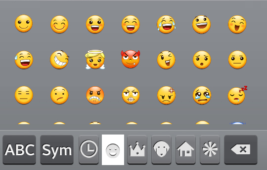
Oh and how could I forget, that annoying emoji/emoticon button! KitKat added a terribly annoying button to my keyboard, a smiling face, which whenever you accidentally click on it, becomes the default extras button; that’s the lovely little button next to the space key that gives you the option of voice typing, pasting, visiting settings, and now also adding an emoji.

Samsung emoji keyboard

The emoji on my Samsung Galaxy S4 Mini keyboard

Now I’m not against emoji, some of them are pretty cool… 🙂

…what I am against is Samsung emoji. The super-duper Samsung upgrade to KitKat may have enabled me to send emoji – yay! – but it came at a cost: MMS. If I want to send an emoji, Samsung very kindly converts my text message (an SMS) into an MMS.

This isn’t a problem if you get a large number of MMS messages included in your contract, but most people (at least here in the UK) don’t. I’m not someone who does either, so when I tried to send a message (no bigger than one standard text message) with an emoji in it, I got charged 33 pence by my provider and worst of all the recipient was unable to receive MMS messages, so they didn’t even get to see my 33p text!

The BBC and Money Saving Expert are just two sites that have recently been warning consumers of the hidden costs linked to emoji usage.

Cue Textra.

Textra SMS

iPhone owners don’t suffer the same fate as I did, because Apple’s default messaging application doesn’t treat emotion icons as images. They may take up more than one character, but you can use them in SMS messages. Not wanting to be outdone, I went on the hunt for a better SMS app.

First I tried Google Hangouts. I have never got along very well with Hangouts, but when I started using it for text messages, I didn’t find it quite so bad. I could send emoji as text messages, and I could type as many characters I liked and it would just send multiple SMS messages; Samsung’s default messaging app converts messages larger than three texts into MMS messages too.

After a week or so, Hangouts’ lack of features and general design started to get on my nerves, so I was out on the hunt again for another alternative. After reviewing a handful of very viable alternatives, I decided to give Textra SMS a try.

Textra SMS quick reply

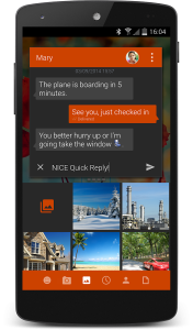
When you get a new text, Textra SMS enables you to reply quickly, without opening the full app.

To put it simple, Textra is fantastic. You can do pretty much everything you can with Samsung’s standard messaging app, and more. You can customise the look and feel, you can send as may characters as you like without it converting into an MMS, and you can send emoji!

One of the awesome features that got me hooked on Textra is the message preview. Say you are browsing the web and you get a text. Texra has the option of a notification which appears at the top of your screen; the notification is basically a message preview. If you ignore it, it disappears after a few seconds, but if you click on it and it opens a small version of the app over the top of whatever you were doing previously. You can type a reply and then as soon as you click send, it disappears and you are back to what you were doing.

If you are looking for an alternative texting app for Android, I would definitely recommend Textra.

Possession App Review

Watching a soccer match is exciting enough on its own. Imaging taking that experience and making it more engaging by being able to keep your own stats on the game while you watch. You don’t need pencil and paper. Nope, there is an easier and more technology-driven way to do it, keep it, and share it.

Possessions, by John Shackleford, is a neat little app that allows you to keep score and more of each game you attend or watch on TV. You could be watching a game at a youth soccer match, or you could be watching the English Premier League. Either way, this app that works on both iPad and on iPhones will be at the ready, allowing you to tap away game scores, shots and corners without blinking an eye. The app has a bit of a price tag, costing $10.99, but it packs a punch in valuable data, whether you use it to strategize for your child’s team, or you map trends for your favorite team as it treads its way towards the World Cup.

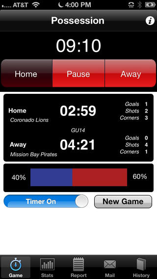
Possession screenshot

Once you download the app, you’ll see how easy it is to use. The main screen features a timer that can be “assigned” to each team as possession of the ball passes between them. This is done with just tapping either Home or Away. The timer will time the game in general and will keep individual possession times for each team as you indicate the switch when the ball changes “hands.” The main screen also shows the number of Goals, Shots and Corners for each team as well as a clear graphic that indicates the percentage of possession time for each team. This is essentially a bar colored in two shades, each increasing or decreasing in width to represent possession time by each team, and is also flanked by a percentage on each end.

Starting stat collection requires you to press New Game and then swipe the Timer ON. Before turning on the timer, it is wise to move over to the Report page so you can enter each team’s name, their gender if you wish, their age and then select whether or not you wish final stat reports to be emailed. On the subject of emailing, you can specify email recipients on the Mail page. This makes sharing much easier and allows others on the team, like the coach and fellow parents to see the stats. If players are older kids, they may want to get in on the action as well.

The easiest way to use this app is to set up the static information on the Report page first, and then move over to the Game screen, or main page. Next, start the timer and select the team in possession. Now, you might want to quickly move over to the Stats page so you can easily tap on Corners and Shots as they happen. Soccer moves fast, so you need the screen up and ready, or you may miss a moment.

The only thing that I found to be a bit tricky in using this app is the need to switch between the Game and Stats screens. It would be easier to use if you had controls to switch possession and update shots, goals and corners, all on one page. Yet, overcoming this one issue, Possession can make data collection on games much easier and produce a wealth of knowledge for your team for seasons to come.